Need to represent data in a way that really grabs attention? That calls for an infographic. Preferably interactive. Preferably global. And most preferable of all, encompassing the entire planet. Here are six world maps that could suck you in for hours (so don’t open them if you have urgent business to attend to). Everyone else, welcome to our list of top Internet globes.
Google Earth: The one and only
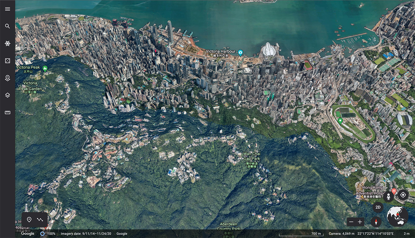
It’s scary to think that Google launched its Earth project 20 years ago. The map grew and changed, became popular, and then seemed to fall out of fashion — unjustly, it has to be said. The current version not only lets you scour any piece of land to find your home, but also now features 3D models of the planet’s top architectural monuments and geographical wonders. Anyone sick of gazing at the Sydney Opera House or the Eiffel Tower can take a computer-generated flight over the Alps or the Himalayas. The app includes virtual tours for those cooped up at home because of the pandemic, as well as handy tools for measuring distances and calculating areas.
LeoLabs: Everything in orbit
https://platform.leolabs.space/visualization
This globe will appeal to prophets of doom and fans of conspiracy and espionage theories: The map tracks all of the satellites (and what they are turning into, i.e., space debris) currently orbiting our planet. You can zoom in and hover your mouse cursor over any object to find out its name and type (satellite, debris, or something else). Detailed satellite information, sadly, is not provided, but you can do your own online search based on names.
Ventusky: Weather at your fingertips
Nothing to talk about? That’s what the weather’s for! This map provides real-time visualizations of meteorological data for any location on Earth. On the left-hand side, you can select temperature, cloud cover, pressure, precipitation, humidity, air quality — anything that goes on outside. On the right, you can change the units of measurement so as not to wrestle with inches versus centimeters or Fahrenheit versus Celsius. The timeline at the bottom offers a rudimentary weather forecast. Our favorite pastime at the moment is checking the temperature in Verkhoyansk, that well-known vacation spot and an excellent data point for anyone who complains “it’s a bit chilly today.”
Flightradar24: Everything about aircraft
https://www.flightradar24.com/
For those frustrated with the lack of detailed satellite data in LeoLabs’ visualisation, welcome to Flightradar24. Here you can find out about almost any aircraft currently in flight or about to take off, in real time. That includes information about the airline, place of departure and destination, model, altitude, speed, and route progress. Besides being incredibly interesting, the service has practical benefits for those who like to keep everything under control. Say you’re meeting someone at the airport: Just enter the flight number on the Flightradar24 to learn the plane’s precise landing time. Flight info on the airport website is for wimps.
Paid subscribers get to see a more comprehensive flight history, with aircraft serial number, vertical speed, outboard temperature, and a bunch of other stats for true aviation geeks. Incidentally, a similar map exists for seagoing vessels. And even though the Ever Given blockage has long been cleared, it’s still fascinating to watch the marine traffic through the Suez Canal.
TheTrueSize: Which is bigger, Greenland or India?
The greatest ever illusionist is not David Blaine or your bank manager, but Gerardus Mercator. There are other ways to project a sphere onto a plane, but the world map familiar to everyone since childhood is his. Print out the map and try to stick it evenly onto a globe, however, and you’ll drift off course — and as you get closer to the poles, the size mismatch only increases. The trick is, with the Mercator projection, the horizontal dimensions in the extreme northern and southern latitudes have to be stretched, which causes Greenland and Africa to look roughly equal in size.
TheTrueSize lets you take any country — from that same Mercator projection — and drag it around the map to make objective comparisons. Just type a country’s name in the search bar, and when it’s highlighted on the map, drag it to a different part of the world to see, for example, Mexico’s real size relative to Europe, or the Democratic Republic of the Congo’s to Alaska. Not recommended for users from Greenland.
Earth 2050: Glimpse the future
It’s our very own predictions of the future, all in one interactive globe. Choose a planning horizon (to 2030, 2040, or 2050) and find out which fruits of progress will ripen. Check out when the first underwater farms, transformer apartments, and Martian colonies — or even (don’t hold your breath) Half-Life 3 — will appear. Some predictions come from professional futurologists, others from users. So if you feel like the map is missing something, we encourage you to share your vision. Note that submissions are moderated, so please try to keep them within the laws of physics.
 Internet


 Tips
Tips